
Manzo Piedmontese
I developed the visual identity and brand experience for Manzo Piedmontese Beef, a premium beef producer rooted in the heritage of Italy’s rare Fassone breed.
The work included creating the logo and visual identity, sourcing typography and imagery to establish the brand’s refined yet agricultural character, and extending the system across a custom website and branded shipping packaging. Each touchpoint was designed to balance the brand’s heritage and craftsmanship with a contemporary, elevated experience—from the first digital impression to the moment a client’s shipment arrives at their door.
Role: Designer, Project Lead , 2023
Agency: Pentagram Austin, Partner DJ Stout
Collaborators:
Manzo Piedmontese Team
Identity

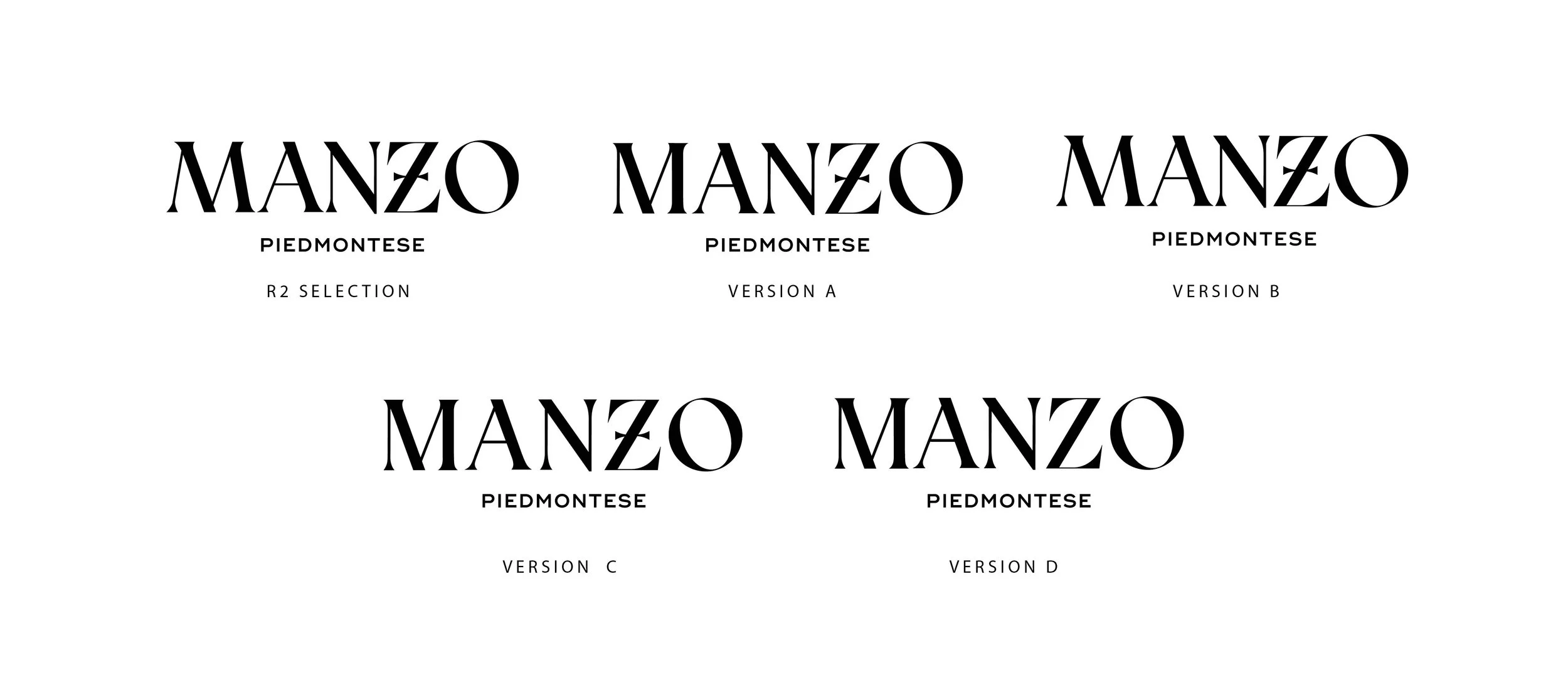
I explored a range of logo and wordmark directions to create an identity that felt elevated and sophisticated while remaining rooted in the history and strength of the Piedmontese breed. Variations introduced distinctive typographic characteristics, including custom treatments to the “Z” inspired by medieval shields, heraldry, and the markings historically used on letters and emblems.
The final direction was designed to feel as though it could have existed for centuries—strong, established, and timeless—while still feeling relevant to a new generation of consumers. The result became the foundation for a broader visual system carried across digital, print, and physical brand experiences.
Imagery
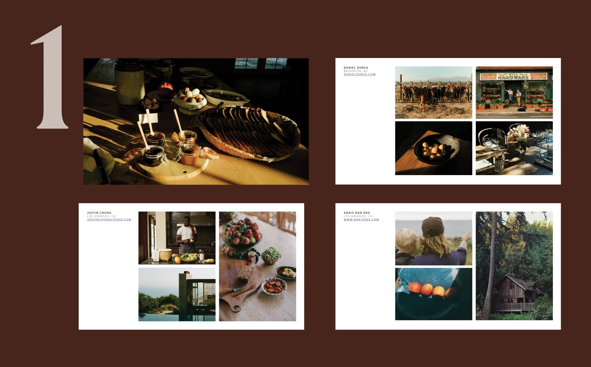
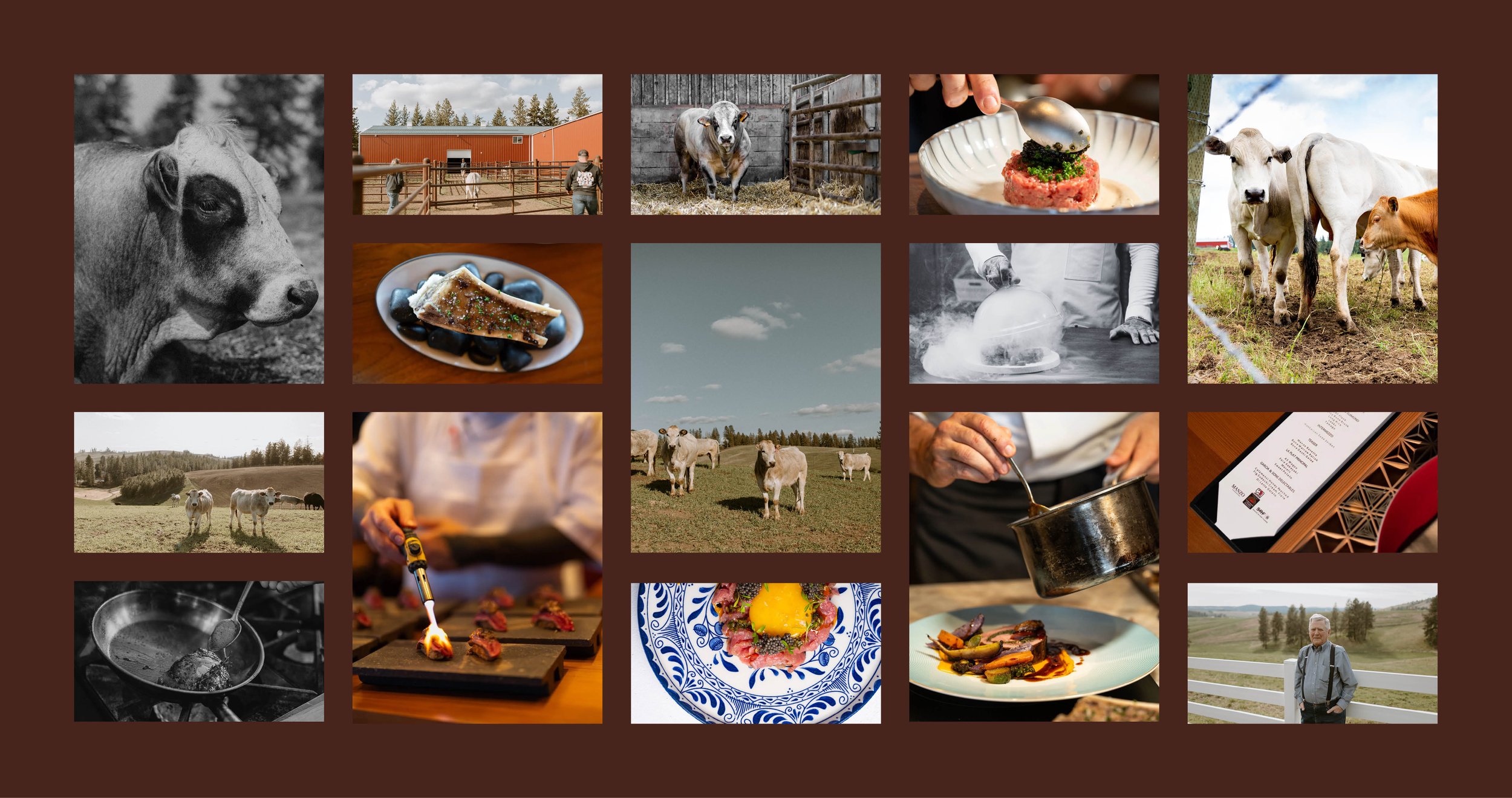
I curated imagery that I felt best communicated the intersection of heritage, land, craftsmanship, and the animals themselves. Rather than relying solely on traditional cattle photography, I looked for imagery that captured the atmosphere surrounding the brand—from the character of the Piedmontese breed and open landscape to the hands-on nature of ranching and butchery.
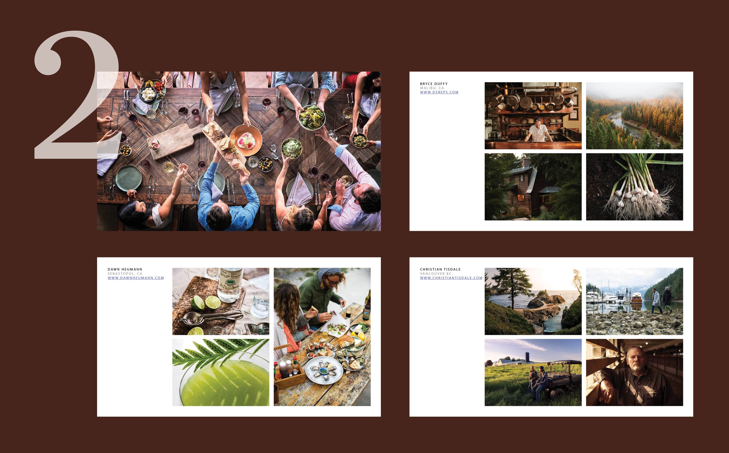
To establish a visual language for Manzo, I developed three distinct photography frameworks, each with its own mood, and storytelling approach for the client to review:
Moody & Painterly
Rich & Crisp
Refined Luxury.
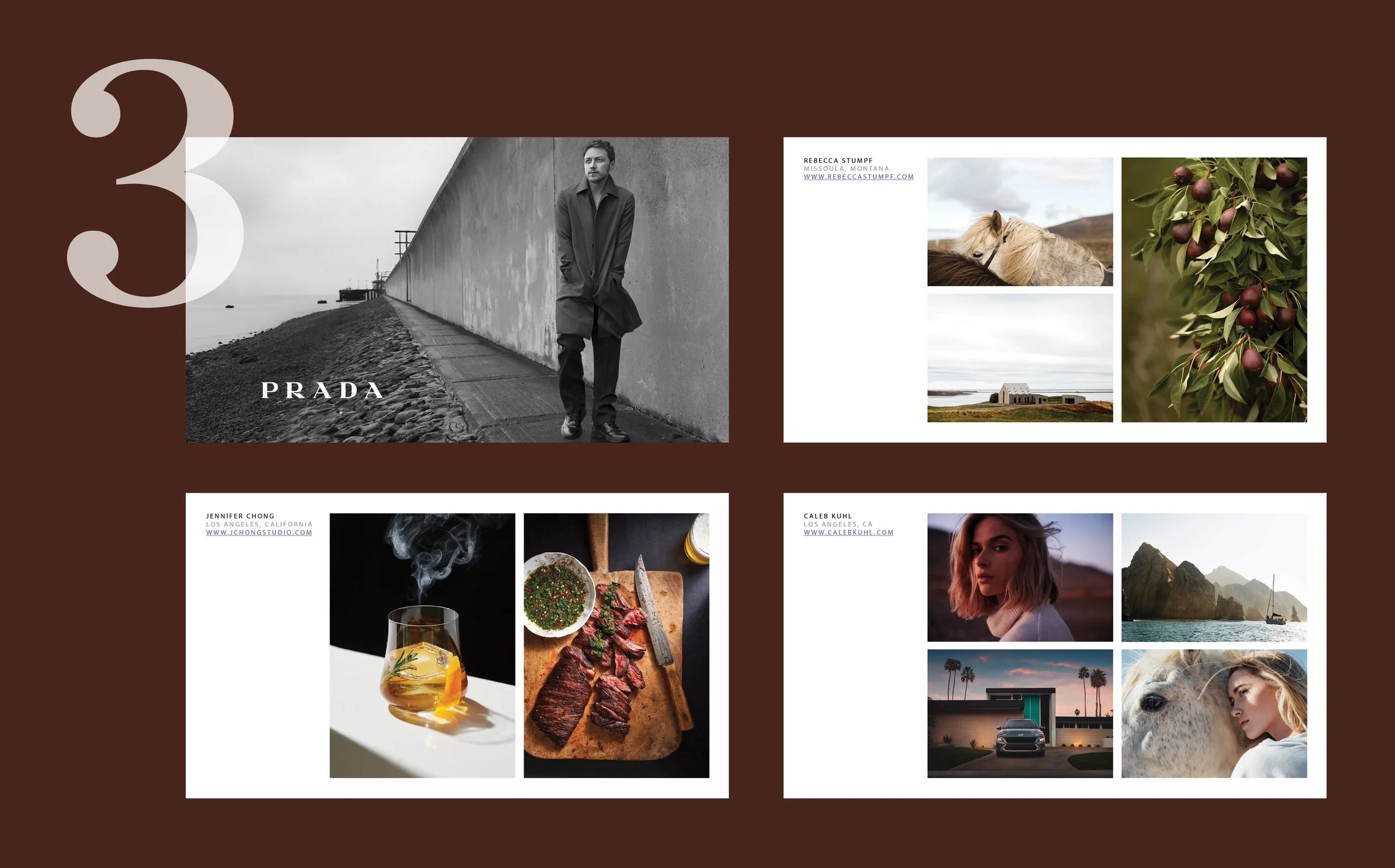
Ultimately, the #2 Rich & Crisp framework option was selected by the client as the visual direction of choice. The framework pairs sharp, detailed imagery with deep, saturated color palettes to create a sense of vibrancy and energy. The goal was to make Manzo feel like a portal to something new and exciting—inviting viewers to look closer, discover the breed, and experience the world behind the brand.
The resulting visual direction pairs intimate, editorial-style photography with the brand’s refined typography, creating a balance between the rugged authenticity of ranch life and the elevated one of a kind experience Manzo offers its clients.
Packaging
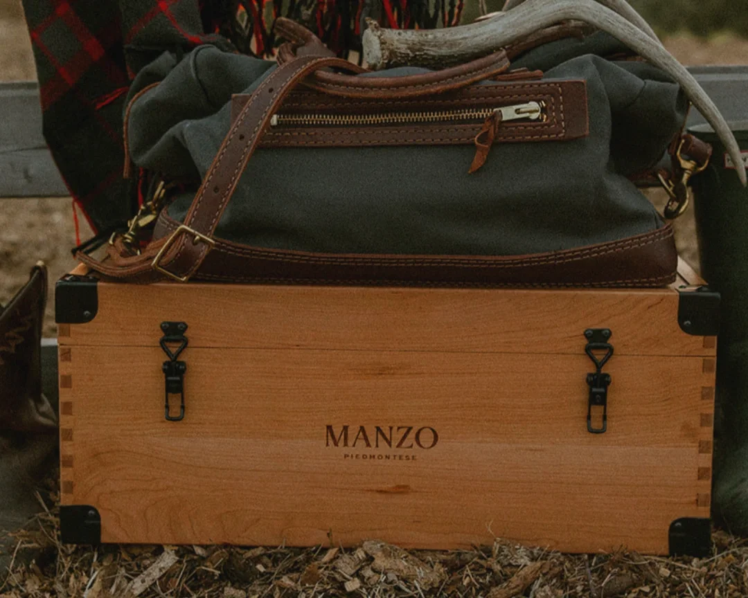
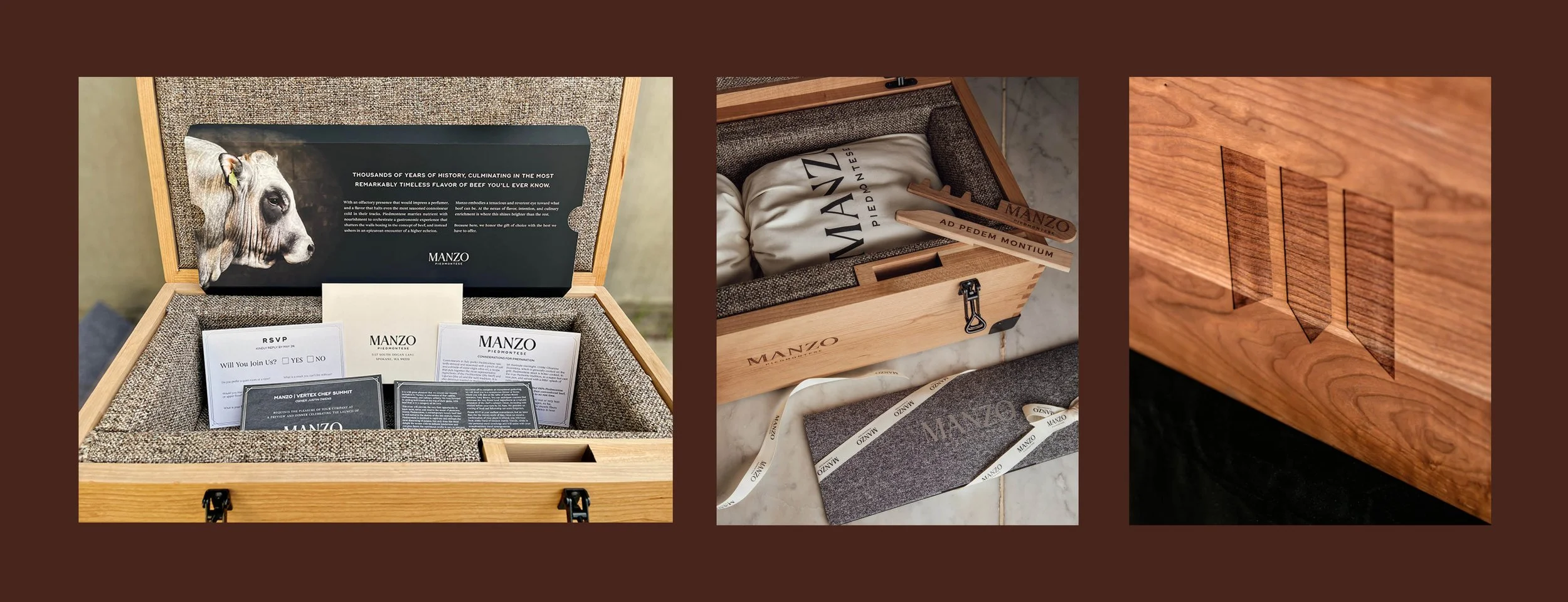
The shipping box became an important part of the Manzo experience—a physical introduction to the product before the box is even opened. I assisted with designing the packaging to feel intentional and premium while remaining connected to the agricultural roots of the brand.
The approach was to create a bold, recognizable exterior using the Manzo identity and restrained typography, allowing the packaging to stand out in transit without feeling overly commercial. Inside, the experience continues with a considered presentation that reinforces the care, craftsmanship, and quality behind what has been delivered.
The result turns a functional shipping container into a branded touchpoint that carries the Manzo experience from the ranch directly to the client's table.
Website
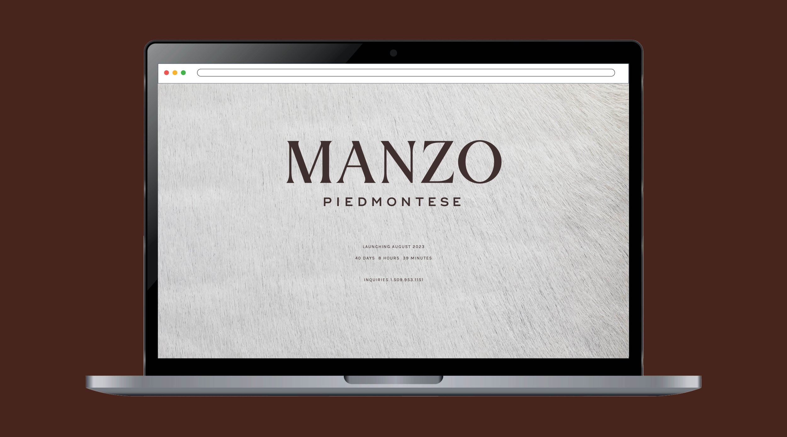
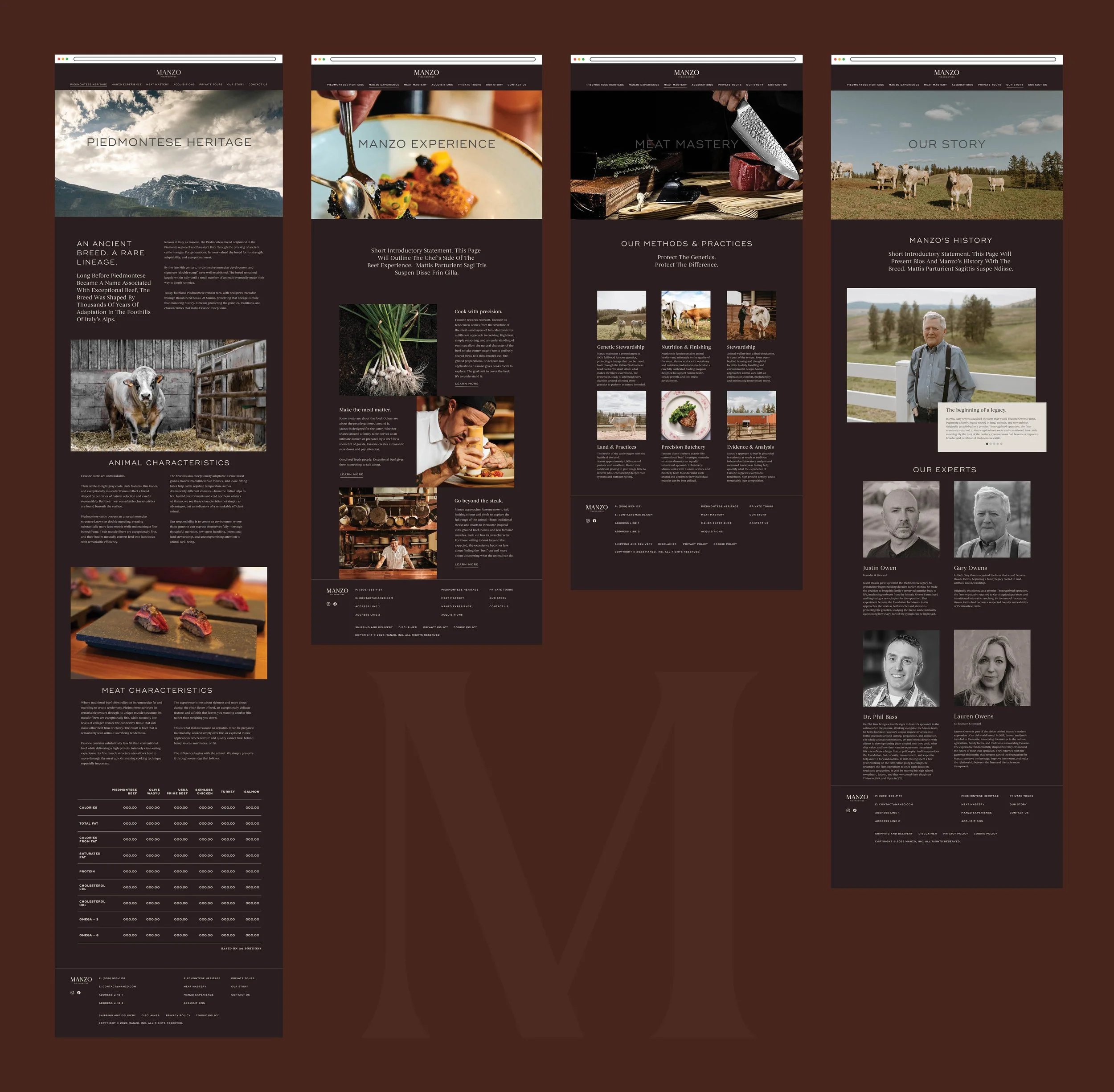
While the full website was being developed, I created a temporary landing page that offered a visual hint of what was to come. A close-up cattle hide texture served as the background, creating a sense of mystery and curiosity while introducing the brand’s visual language.
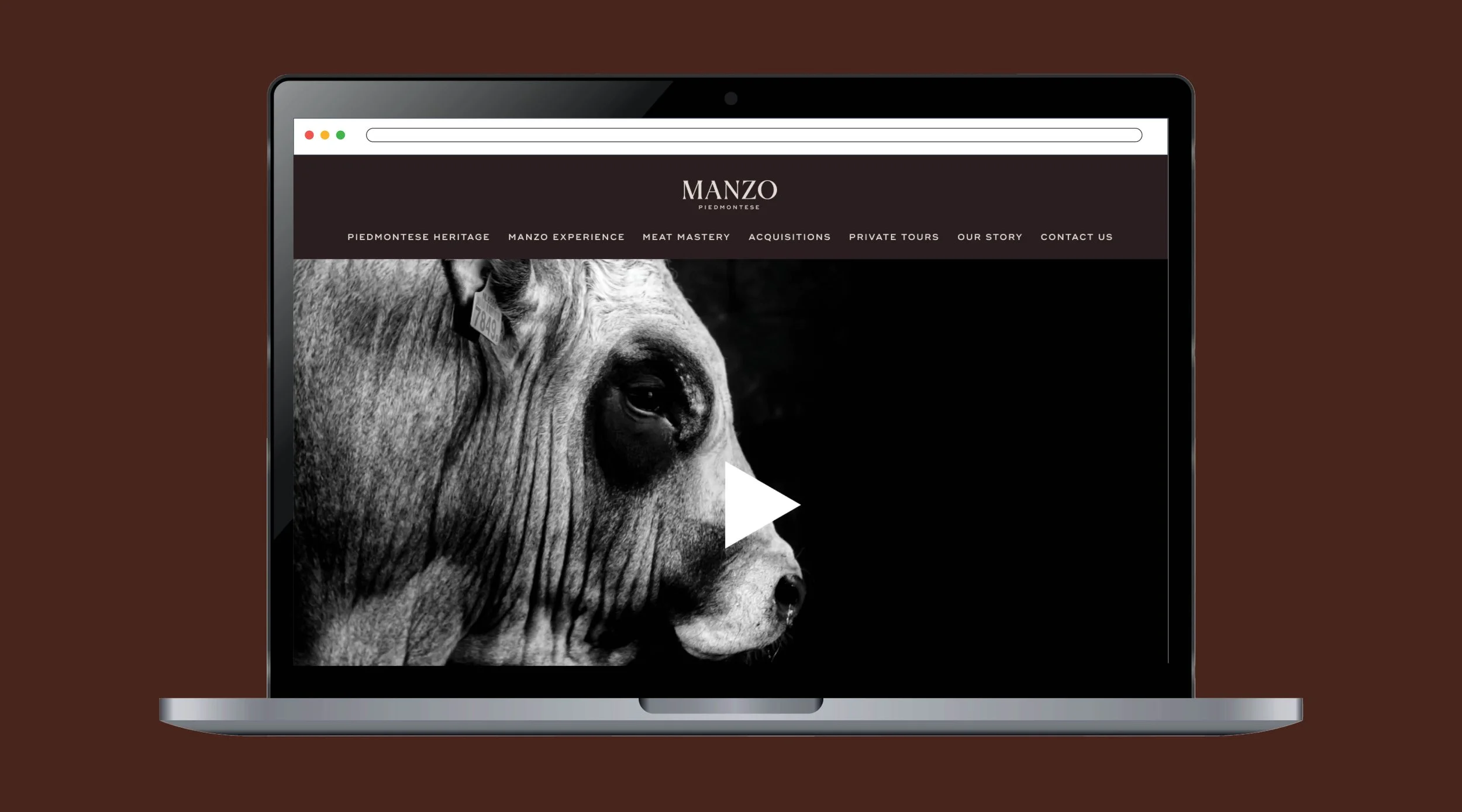
For the full website, the design was intentionally image-led, using generous negative space and a clear typographic hierarchy to create a refined, elevated, and luxurious feel. Each page opens with a large, full-bleed hero image, followed by alternating photography and supporting copy to create visual rhythm and naturally guide the viewer through the content.